In the previous article talked about the principles of web design CRAP , now these are some examples of these principles apply sonde and where not.
Contrast.
A good contrast can relate areas that have some similarity or relationship, and separate the voiceless. Be sure to compare your items and sections. An example is found in the blog of Jason Csizmadi, Dangergraphics.com .
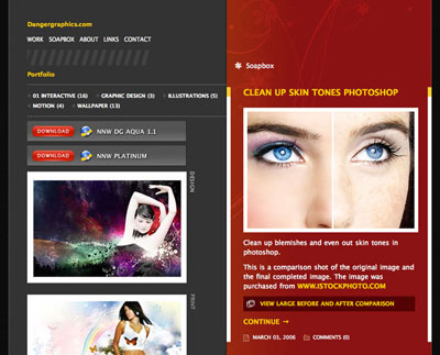
Its site is separated into two columns perfectly differentiated visually indicating that contents are completely different. The right side is a blog, and has left some of his recent work and links to other sites.
Moreover, we have an example of poor contrast in Northrop Grumman's Capabilities .
Moreover, we have an example of poor contrast in Northrop Grumman's Capabilities .
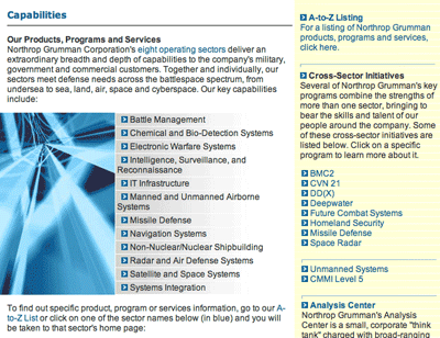
The soft yellow background visually separates not enough and they use the same font for the text for headers. The headwaters of the major sections are limited to pass bold font, and that is not enough to separate and distinguish. If you wear a larger size for headers and the bottom of the column of the right to be more different, they would get a better visual contrast and better organizing your items.
Repetition
If you've ever designed a blog, you know something about repetition. Commonly, blogs have a structure that is repeated in all, a head, a foot, a text column and one with extras like navigation links.
The repetitive nature of blogs makes them easily identifiable. As a result , the reader knows where to go at all times. Imagine that every post on our blog, sometimes the post date is under the head, and others at the end of this. This would lead to undesirable confusion.
An example with Blog 9rules :
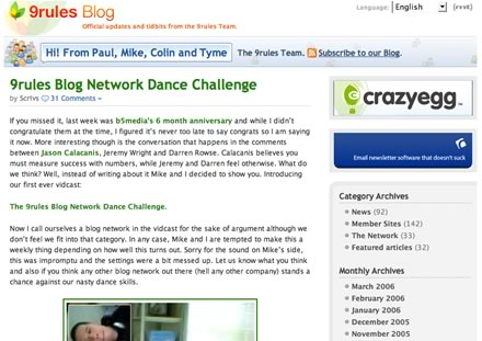
This blog has the typical layout of which we spoke. They have used similar design metaphors:
The typography of the message body is Lucida Grande (Verdana in Windows ).
The headers in the blog, and that are in the column on the right are in Trebuchet MS with a separation line of dots below.
The links are in bold, and within the posts are in bright green to correspond with tiulo.
All sections in the column on the right have a gray border around 7px.
Alignment.
A good alignment and separation is a mark of good web design. Ten out of habit ensure that the space between elements is symmetrical relative to their sizes. Here are some rules regarding the alignment on the web.
Use text flush right or left, but not both. Text to the right in a column that is in the right causes a river of white space that is appalling. If the body of your site is aligned to the left, use the same alignment for your spine.
- Centered Headers are elegant, focused bodies are not. Two examples of headers centered and left-aligned bodies areMcSweeney's and A List Apart .
- Accurately aligns your items. If your head is 5px away from the left edge of the page, indented text 5px page too. It is necessary not 7px 5px.
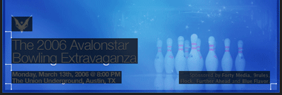
Let's look at the top of SXSW Bowling a good example of how to align elements.
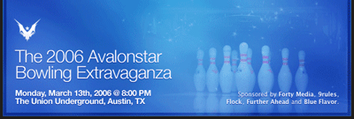
It has 4 different areas on the head, and all are aligned to better communicate the message and produce the maximum effect.Use the left and right edges of the image to align text and image of the phoenix, besides maintaining the same spacing around the 4 elements for symmetry, a technique that should be emulated.
Alignment repetitive and symmetric space are two techniques you can use similar interfaces extensively in the blogs, simply because there are many opportunities to group items in any widget or rectangular areas.
Proximity.
The proximity principle allows grouping related or similar elements. Unrelated elements should appear so visually too. This allows a glance recognize which parts are related or not within a website.
Page Matt Brett's used this technique in their section headers.

For each section title, has a subtitle just below that provides some more information about what is that section. The space between them is minimum, and this provides a logical relationship. However if the subtitle was 10px smaller, the effect would disappear because the space between the two elements do not group together correctly.
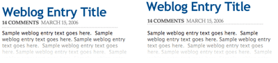
This technique is very useful in designing blogs, because many blogs do not put their second-level headers close enough the paragraph as to establish a relationship, and without the proper spacing seem separate elements rather than linked. Here's an example of how to do it (left) and incorrect spacing ( right ).
This technique is very useful in designing blogs, because many blogs do not put their second-level headers close enough the paragraph as to establish a relationship, and without the proper spacing seem separate elements rather than linked. Here's an example of how to do it (left) and incorrect spacing ( right ).
The headers should appear near the paragraphs, and this can also be applied to images with footers, comments with the authors' names, and so on.
CRAP principles will be very useful in your day to day, if you use them from the beginning, you habituarás to them and you will not think about it.
Post By :-Imeshmaduvantha
1 comments:
well I commented more sobbre Graphs TO BE USED AS THE SOCIEDASD
Post a Comment