Showing posts with label Web Design. Show all posts

Saturday, February 9, 2013

Examples which apply web design principles


In the previous article talked about the principles of web design CRAP , now these are some examples of these principles apply sonde and where not.

Contrast.

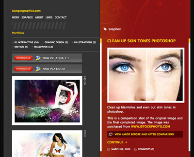
A good contrast can relate areas that have some similarity or relationship, and separate the voiceless. Be sure to compare your items and sections. An example is found in the blog of Jason Csizmadi, Dangergraphics.com .
dangergraphics
Its site is separated into two columns perfectly differentiated visually indicating that contents are completely different. The right side is a blog, and has left some of his recent work and links to other sites.
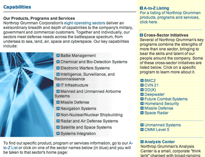
Moreover, we have an example of poor contrast in Northrop Grumman's Capabilities .
dangergraphics
The soft yellow background visually separates not enough and they use the same font for the text for headers. The headwaters of the major sections are limited to pass bold font, and that is not enough to separate and distinguish. If you wear a larger size for headers and the bottom of the column of the right to be more different, they would get a better visual contrast and better organizing your items.

Repetition
If you've ever designed a blog, you know something about repetition. Commonly, blogs have a structure that is repeated in all, a head, a foot, a text column and one with extras like navigation links. 
The repetitive nature of blogs makes them easily identifiable. As a result , the reader knows where to go at all times. Imagine that every post on our blog, sometimes the post date is under the head, and others at the end of this. This would lead to undesirable confusion.

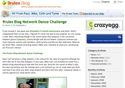
An example with Blog 9rules :
dangergraphics
This blog has the typical layout of which we spoke. They have used similar design metaphors:

The typography of the message body is Lucida Grande (Verdana in Windows ).
The headers in the blog, and that are in the column on the right are in Trebuchet MS with a separation line of dots below.
The links are in bold, and within the posts are in bright green to correspond with tiulo.
All sections in the column on the right have a gray border around 7px.
Alignment.
A good alignment and separation is a mark of good web design. Ten out of habit ensure that the space between elements is symmetrical relative to their sizes. Here are some rules regarding the alignment on the web.

Use text flush right or left, but not both. Text to the right in a column that is in the right causes a river of white space that is appalling. If the body of your site is aligned to the left, use the same alignment for your spine.

  • Centered Headers are elegant, focused bodies are not. Two examples of headers centered and left-aligned bodies areMcSweeney's and A List Apart .
  • Accurately aligns your items. If your head is 5px away from the left edge of the page, indented text 5px page too. It is necessary not 7px 5px.
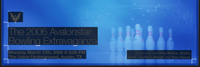
Let's look at the top of SXSW Bowling a good example of how to align elements.
avanlostar
It has 4 different areas on the head, and all are aligned to better communicate the message and produce the maximum effect.Use the left and right edges of the image to align text and image of the phoenix, besides maintaining the same spacing around the 4 elements for symmetry, a technique that should be emulated.
avanlostar2
Alignment repetitive and symmetric space are two techniques you can use similar interfaces extensively in the blogs, simply because there are many opportunities to group items in any widget or rectangular areas.

Proximity.
The proximity principle allows grouping related or similar elements. Unrelated elements should appear so visually too. This allows a glance recognize which parts are related or not within a website.

Page Matt Brett's used this technique in their section headers.
mattbret
For each section title, has a subtitle just below that provides some more information about what is that section. The space between them is minimum, and this provides a logical relationship. However if the subtitle was 10px smaller, the effect would disappear because the space between the two elements do not group together correctly.
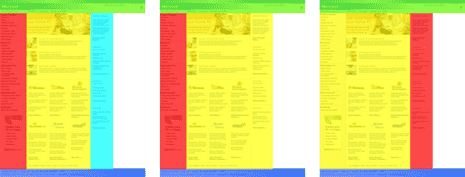
This technique is very useful in designing blogs, because many blogs do not put their second-level headers close enough the paragraph as to establish a relationship, and without the proper spacing seem separate elements rather than linked. Here's an example of how to do it (left) and incorrect spacing ( right ).
entryspacing
The headers should appear near the paragraphs, and this can also be applied to images with footers, comments with the authors' names, and so on.
CRAP principles will be very useful in your day to day, if you use them from the beginning, you habituarás to them and you will not think about it.

Post By :-Imeshmaduvantha

Web Design Principles


There are four principles that help create basic best designs. Also known how that CRAP stands for Contrast , Repetition, Alignment and Proximity . The definitions of these principles :

01. Contrast : Items that are not the same, must be different, making them slightly different only lead to confusion among them unconsciously relate. Contrasting sharply items, get the user moves from one element to another correctly until the end of the page, thus avoiding a sea of similarity being very boring.

02. Repeat : Repeat the style of your site for all of it, creating consistency. If elements relate in a certain way in one area, this trend repeated in other areas.

03. Alignment : Everything on the page needs to be visually connected to something else, nothing should be out of place or different for all other design elements.

04. Proximity : The proximity creates a relationship of meaning, related items should be grouped, and between different elements should have enough space between them so that they appreciate that distinction.

Wednesday, February 6, 2013

20 rules for creating successful websites


Many of the projects and items that were created or written are still popular in the network. The funny thing is how I carried out my ideas on the web, I've never thought about how to make the popular page, tune your position in the search engines and potential customers to find it. The basic idea was to help people. First, help me but also to share my work with people who may need help from time to time. And essentially, that's exactly the attitude that has conditioned and conditions that thousands of visitors to walk around my page - a week.
In the last 12 months , I have development some sites, I found some concepts and ideas that have helped me to improve the quality of web design and information to show on my pages. Furthermore, I understand some facts unknown, acquired a vision of how to create web pages and how to create them well. Since this information may be of interest to the public, I want to share with you, showing the key points in the list below.
So basically, Article 20 rules for creating successful websites is my selection of ideas and concepts that can help you improve the quality and popularity of your web pages and provide a good foundation for developing successful futures.
  1. Take into consideration your visitors : intenes not force your visitors to read the content of your web pages. You let them decide what they want to read. If you have something to say, you'll find your listeners. Frankly, you're as good as any. What would be your reaction in a site with dozens of pop-ups and an excessive number of commercial breaks? That's it.
  2. Bad ads are evil. annoying advertising can improve your income for a while, but ultimately will not help your site to be successful. The truth is that you do not earn the respect and potential will get you and your projects should have.However, the ads perfectly combined with the main content and well placed in the structure of the site (eg devblog.de ,Denny Devblog.de Carl has placed its advertising from Google Adsense in the right column. Do not you realize at first glance it is properly adjusted and the structure of the site).
  3. Informs and educates your visitors. ensamientos Share your ideas, experience and knowledge with those who may need or perhaps may want your advice. Since you have information, you have a powerful tool to attract public attention to your work, interests and services. Also, if you share your valuable knowledge with others you will be respected and taken into consideration as a person who knows what he's talking about .
  4. Develop your own style. Create your own ideas. Be inspired but do not copy. It's much more interesting to find that you're able to not what others can do. Explore your imagination and curiosity. Fresh ideas and new or old but improved probablemnte attract more users to the copied.
  5. Respect the standards, think people. When you take into account the web standards will be saving a lot of work in the future. It will not be long before web standards become a standard on the web: as you create web pages for people, it is reasonable to lose some extra time to check the code to respect the standards - in the event that the code not comply.Once done, you should not worry about the new versions of browsers. Basically why you've done a good job. readability, accessibility and usability. Respecting these points, you are respecting your visitors.
  6. Be clear. Use plain language. topics not say what you mean. Being ambiguous unnecessarily creates distance between you and your visitor. Be precise about what you want to discuss or present to begin an active dialogue with your readers. In addition, if you specify what you're talking about is more likely to receive feedback (feedback) or a response to the topic you propose.
  7. Hate Internet Explorer if you want, but do not ignore your users. Do not project your code in mind especially a browser, or a particular resolution. Without embarkation, guides your code to Internet Explorer bearings exactly as other browsers. And although I personally try to avoid the "hacks", sometimes you can not avoid them - however should be the last option. Internet Explorer is not the best browser .
  8. Take care of your content. develops websites, trying to make them informative, interesting and look nice. Do not forget that your visitors will remember everything. If you offer a visitor a link to a page inadequate without the appropriate description of what lies behind that link, you'll never see it again. The code is poetry , your content is prose.
  9. Do not worry about the web-crawlers and SEO. not think about keywords, it is more important what your site can offer. Refine the position where you appear in the search engines will take much longer to write a useful article on your blog. Also if you consider yourself an expert in SEO you should know what to continually optimize your site for better results in the search engines. On the other hand, if you publish an article will be (hopefully) available while the site exists.So, just write it once.
  10. (9a). Avoid methods PR SEO or harmful. Optimize for search engines incorrectly (eg exchanging links with all possible sites, placing your link in link farms, etc.) only serve to eventually be expelled from your site Most browsers. The algorithms of the search engines are constantly being improved, so that eventually your efforts will not be of any use if you risk encountering a PageRank 0 in any possible outcome that you've played. And besides that, once your reputation is low, it will be extremely difficult to get a good position at the top of the web development community.
  11. Contact but spamees. Let those who may be interested in your content, be aware of the same. First outlines your potential clientele. Then keep to those who may be interested in your services. Think about the places that is likely to visit. Contact only with the authors of these sites, offering a description of your services. However keep in mind that you are not writing for a robot (spider web), but a human can decide - or not - share you with their readers or - more significantly - to visit your site. Be descriptive, not send a link instead sends an invitation to the appropriate description of what makes your site different from similar projects. Make sure the person you are writing to is who can be useful to visitors of your (s) site. But again : remember that what you've created is not for your money, it is for people. Do not send spam, and you advertise, offer useful content.
  12. Write, post, feel free to ask. There was always an abundance of web developers who are asking the same question you are making you now. Feel free to ask or look for your answer please. The more intelligent the more chances you have questions to be answered, so that more people will find your site through search engines.
  13. Immediately answer your correspondence. Sets as fast you can touch with your potential customers, do not allow your email rest in incoming folder for more than 12 hours. Do not send automatic replies. The person who wrote you know you've been writing to you. So do not waste the time of other people in the same way that you do not like to waste yours.Instead try to create a good impression on the person who has contacted you. Answer secure so professional, friendly and open writing style, do not make promises but - again - feel free to answer.
  14. Use the advantages of the semantic web . tag, label and tag. Do not be afraid to mention your site on Digg (N. Translator: For speaking you can intersperse Digg by Meneame ), Reddit , Blinklist and hundreds of other social links managers . However you choose to use labels carefully. Visitors will want to come. And if the labels are chosen rationally, even more visitors will come. You can also encourage your visitors to tag your items at the most popular social administrators links.
  15. Create connections. always creative developers are supported by windows of CSS ("CSS Showcases"), galleries and blogs of other web developers. Something of this is mentioned here .
  16. Think globally. The content of your web pages can not attract people to the region, but the web barriers are imprecise and difficult to see (if they exist after all), so why not send your message to the world?, there is the need to find a new niche close to you if you have unlimited opportunities around the world.
  17. Never compromise your principles. Discuss how a site should be presented or developed, respect your customers and your point of view. But keep in mind that really you who developed the site. Do not do exactly what you have asked.Corrects errors if you realize that the customer is wrong. Be professional - at the end your goal is to create the site for users, not for the customer.
  18. Remains active. stay informed about what is happening in the network. The web is developing rapidly and new ideas are shared instantly. The best way to stay active is - of course - using the RSS feeds of the most popular web development blogs. However magazines related to graphic design and web development such as AListApart , BoxesAndArrows ,Digital Web Magazine , Design in Flight , Poynter , Layers Magazine or Graphics.com are worthwhile reading.
  19. Become proficient creativity. Find a new idea to exploit, try looking through web development forums focusing your attention on the people who are looking, for example Sitepoint.com is a resource visited by hundreds of web developers every day. Another option is ... well, take a break.
  20. Create beautiful web. Use CSS, to be clear, legible and intelligent design is beautiful. How can you resist such beauty?, Participate in open competitions as CSS Table Gallery , CSS Zen Garden , Comment Design Showcase ,Typography for headlines , Form Assembly Garden or sIFR Beauty Showcase . So make life easier for other developers showing your style and your experience.
  21. Be aware of the power of the web. You're creating the Web, so you have something to say. Supports projects that seem important to you and must be supported because their goals are something worth fighting for.Makepovertyhistory.org is a great example.
The above rules do not guarantee any success if you do not believe in what you're doing and explore your creativity. Each idea can be "the idea."
This is all I could think Any suggestions?, any ideas?, Feel free to comment!.
Via | sigt.net

Stop using HTML tables and learn to use CSS


This article originally titled Throwing Tables Out the Window written by Douglas Bowman and translated into Spanish by Hermann Käser, here are very interesting article.

Look ma, no tables!

Those who were in the Digital Design World in Seattle this year I saw a presentation entitled No More Tables , CSS Layout Techniques (No more tables, CSS design techniques). In this presentation, we review the proper use of tables and a few tips on how to style with CSS añadirles. Then we went to tableless designs, looking and seeing examples both ways of doing basic (positioning and floating).
In half of the presentation changes his mind and announced that we were going to turn true example of tables and spacer gifs to pure CSS design. It would have created a practical example for this presentation. But that idea seemed too prepared. If crease my own example, would have been all clean and tidy. Everything would be as I wanted to avoid all the problems and know how to avoid.
A prepared sample was not good enough. I wanted a real challenge. So I chose the site of a small Seattle company that assumed some of the people in the audience would recognize: Microsoft .
Ok, maybe more than any of the public would know this not so little company. Many people visit the site of Microsoft every day. The home page of Microsoft may or may not be more known and used to search giants like Google or Yahoo! . But Microsoft generally receives a lot of traffic and the number of people passing through its pages are literally millions.
The shame is that the product of Microsoft not this as optimized as it should be. They have not taken the plunge ( NT: In reference to changing design with CSS tables ). Users are lowered pages unnecessarily large, and servers spend extra bandwidth. With 40KB, the code page of Microsoft not exactly a giant beast. But if code is full of inaccessible, rough, based on tables, full of proprietary tags and Javascript. Notice I did not mention it to be or not valid HTML. Despite having a style XHMTL, Microsoft ignores the doctype in your page. Why?
's another of those "let's get with Microsoft"?
Not simply and honestly.
Microsoft chose not to enter the wave of "hate Microsoft", or to use to attack a company that the industry people love to hate.(Do not avoid any opportunity to question certain decisions of the company, but avoid judging).
admit I purposely chose a major company. It is my nature to go against the big boys. But it is also an example that we all know. Microsoft was (and still is) the perfect candidate for a redesign based on CSS

These are the reasons for not using tables

Reason No. 1

For the inefficient use of the abundant tables and spacer gifs used for the design of the page. The pages are more tied when its content is into tables and often results in less accessibility. Microsoft not this one . A large majority of the pages on the Internet today still use tables for layout. chose Microsoft because it can serve as a familiar example (and eventually as a model) that relates to the same problems that many sites have yet to resolve.

Reason No. 2

Because the structure of basic Microsoft product is a model that thousands of sites used for your own design: Header + 3 + Pie columns . Specifically: a header that spans the entire width of the top of the page, a column on the left with the navigation, a main column with the main content, a column to the right with extra stuff and a foot that is put columns beneath and occupies the entire width of the page. If the model is not much 3 column sites use a variation of 2 columns with the samestructure with a basic column to the left or right of content:

Reason No. 3

Because Microsoft web site uses CSS to little more than the fonts and colors. I'd love to see the company that basicallyinvention the concept of style sheets, CSS lean more and less on outdated methods.

Reason No. 4

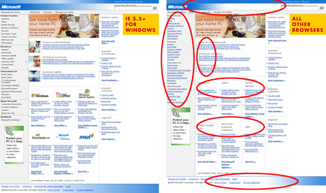
Because Microsoft used different versions of the page depending on the browser. A version for Internet Explorer andWindows (v5.5 and above). Another diluted version for all other browsers (including IE / Mac) that omits some product images and logos. Non-IE/Win version leaves out some functionality and showing page elements with other methods. If you have IE / Win 5.5 or better and you can check other browser. Anyway here are some screenshots with the differences highlighted in red:


Non-IE/Win version is visibly full version anemic that served to IE / Win. We all know that this does not have to be this way. In case you are wondering if it is that the code simply does not work in some browsers and some do. Microsoft makes a browser detection on purpose to produce different versions of the page depending on the browser. Microsoft could make one version that would work in all browsers
At least Microsoft offers a version of its product non-IE/Win browsers. Some developers do not even do that. The excuse I always hear to stop developing for other browsers is that IE / Win is the browser used by most people and that it takes too long to develop for other browsers. Others say that developing for browsers other than IE / Win is too expensive. Both reasons they take long and costs too are false.
Many developers believe these excuses because they begin to develop and test with IE. Then see it in another browser and frustrated when they see all the "bugs" that have to be fixed.
IE CSS plays a less demanding than the other browsers that have come out in recent years (Mozilla, Firefox, Safari, Opera).Beginning with IE means that fewer problems in the development stage will be discovered. Developing for IE initially and then trying to adapt to other browsers cause one increase in cost and time in the long run. But there is a better way to develop that is faster and less expensive.
Begin with the strictest browser, that (almost) always shows the way things are supposed to be. Everything works there. Then make the "patches" to IE. The development is much faster as well. You can go against the logic start developing for browsers that do not account for the largest share of traffic. But the process is much more fluid and efficient if you are not used or are dependent on IE. Start with IE and start with bad code that take much longer to fix for other browsers.
Along these lines, we still have the IE Factor . Anyway as we gain experience with the IE problem with CSS, Factor IE is minimized. There is hope.

Just the facts, please

For the second part of the presentation, we went step by step through the process of converting the design tables based on the Microsoft site to a more accessible and based on CSS that works in all browsers. This is not the first time. Others have re-written the Microsoft page before. Many regular readers of this page have been doing their pages without tables for almost a year. But we do not see the rest of the world doing the same, even though the field is fairly explored. Hence, the presentation in the Digital Design World and this article.
Following the presentation, we separate each step of the process in manageable pieces. Underline the important points of the process, including throwing tables, conversion to more semantic code and CSS techniques used to successfully imitate each part of the Microsoft website.
During the presentation we use many visual aids (diagrams, screenshots and graphics) helped to understand the techniques used in each section. also had separate code files saved in "pre-cooked" to which I could refer to each stage of the process.
One reason for writing this article is to then publish the final results of the transformation of Microsoft.com, which are hard to ignore:

Current Design (IE / Win)
Current Design (other)Transformation


Tables used
40360
Spacer gifs35760
Tags <img>431226
CSS background images1111
Supported browsers2Most modernMost modern
HTML file size40 KB39 KB15 KB
Downsizing-3%62%


Go beyond

The numbers get more interesting when we make estimates à la Meyer / Davidson of ESPN. According to the results published in an official Microsoft product called Inside Microsoft , the Microsoft receives traffico is 1,200 million pages during 05/2004. In this presentation, I showed how to minimize the code below to lower it by 62% to 25KB. I also said that a reduction of 25KB was sufficient if Microsoft is serious put an item using CSS. Multiply this by the 38.7 million average daily visitors savings would add 924 GB of bandwidth per day and 329 TB per year.
These numbers should be sufficient to attract attention.
Now, the fact that change is only one version and supports the most advanced design (currently IE / Win) Microsoft and is seen in all other browsers.
Companies like Microsoft may or may not want to maintain a single version of their product that works with all browsers, which load faster and more accessible to all users and devices. Anyway, I thought it would be worthwhile to demonstrate how they orany other company can create a single version that use cleaner code, works with most browsers and with greater accessibility.All in a time of one or two hours.

Additional Points

In case you want to know, the CSS-5K grew 3KB (IE / Win and non-IE/Win respectively) to 8 KB for the final version. ( NT: Remember that the CSS file is stored in the browser cache and therefore lowered only once )
  • The flying menus seen in version IE / Win is possible to reproduce. We use the pseudo-class: hover to display a list when you select the corresponding item. One problem: IE does not support: hover on the lists, so I would have to use the Microsoft currently uses Javascript. Or something like like Suckerfish Dropdown .
  • The huge change <img> between the current version and the transformation is by the amount of spacer gifs using the current version. Non-IE/Win version called bullet each image individually instead of using a CSS declaration, as do the version IE / Win and transformation.
  • All Javascript Microsoft site was cleared and all the homeowners attributes link labels used to (apparently) count clicks.Microsoft could add something to this level, but preferably with valid code.
  • As mentioned previously, this paper is to publish the results and potential benefits of using CSS and more semantic code and simple to build pages. publish this article intentionally omits the final code. understand that many people could learn from this example studying the differences between the original and the transformed code. But I will not degrade anyone working in Microsoft publishing changes to its source code without presenting it directly to them and discuss technical changes and, if they want.
  • Friday, February 1, 2013

    Give form to your RSS Feed with CSS


    RSS feed icon
    It is easy to give a better look to your rss feed in wordpress with with CSS (cascading style sheets). I'll show you a tutorial of 10 minutes , you can see the results by looking at the RSS feed of this site. Also you can do with XSL style but for now we are going to do with CSS that is easier. To start you need to add the tag xml-stylesheet to your RSS feed , for it opens the file wp-rss2.php and after the line:
    <? Php echo '<? xml version = "1.0" encoding = "'. get_settings (' blog_charset ').'"? '.'> ';?>
    added:
    <? Php echo "\ n <? Xml-stylesheet type = \" text / css \ "href = \" ";?>
    <? Php bloginfo ('stylesheet_directory');?>
    <? Php echo "/ rss.css \"> ";?>
    Then you have to create the file rss.css and place it in your theme directory within this file you define how to display RSS tags, an example of the contents of this file is as follows:
    rss {
    	 display : block;
    	font-family: Verdana, arial;
    	font-size: x-small;
    }
    channel link {
    	display : block;
    	margin: 5px 6px;
    }
    channel description {
    	display : block;
    	margin: 5px 6px;
    }
    item {
    	background : # E8F8FD;
    	 display : block;
    	margin: 10px 30px;
    	padding: 5px;
    	border: 1px dotted # aaa;
    }
    title {
    	font: bold large Arial, Helvetica, sans-serif;
    	display : block;
    	margin: 5px;
    	padding: 2px;
    	color: # 333;
    	border-bottom: 1px solid silver;
    }
    item title {
    	font-size: medium;
    	color: # 666;
    }
    channel {item link
    	display : block;
    	margin: 0;
    }
    {comments
    	display : block;
    }
    {docs
    	display : block;
    	margin: 20px;
    	text-align: center;
    	padding: 5px;
    	color: # 7f7f7f;
    	border: 1px solid silver;
    }
    channel item description {
    	display : block;
    	 background : # fff;
    	border: 1px dotted # f5f5f5;
    	margin: 3px 5px;
    }
    / * To hide labels * /
    language, lastBuildDate, ttl, guid, category, pubDate, generator {
    	 display : none;
    }
    Apparently the Internet Explorer 7 Beta, I would not recommend using is not the style sheets of the RSS, however the RSS will show its own format of them, in Firefox it looks great.
    Thank You!